See these metrics for your own team
CodePulse turns your GitHub history into engineering insights in about 5 minutes. Free to start, no credit card.
Get started freeYour code review metrics might look fine on paper, but the pattern hiding beneath them tells a different story. Code review performance visualization turns raw PR data into a network graph that maps who reviews whose code, how often, and in what direction. Instead of scanning tables and averages, you get a visual map of collaboration dynamics you can actually diagnose. Teams that use review visualization correctly catch bottlenecks, silos, and burnout risks weeks before they show up in cycle time.
What is code review performance visualization?
Code review performance visualization maps reviewer-author relationships as an interactive graph, where each developer is a node and each review relationship is a weighted edge. It reveals collaboration bottlenecks, knowledge silos, and reviewer imbalances that aggregate metrics hide. According to a study of 133 popular GitHub repositories, about 65% had a truck factor of two or fewer, meaning concentrated knowledge is the norm, not the exception. CodePulse's Review Network page generates this visualization automatically from your GitHub data, with filtering, pair rankings, and CSV export.
Most engineering teams track review speed and review count. Those numbers answer "how fast?" and "how much?" but miss the more important question: "who is connected to whom?" A team where one senior engineer reviews 60% of all PRs will have decent average review times, but a single vacation week will grind everything to a halt. You cannot see that risk in a table of averages. You can see it instantly in a review network visualization.
This guide covers how to read review performance visualizations, identify the five common anti-patterns, and take concrete action based on what the graph reveals. If you already have healthy review practices in place (see our code review best practices guide), network analysis is the next level of sophistication that separates well-run teams from guessing.
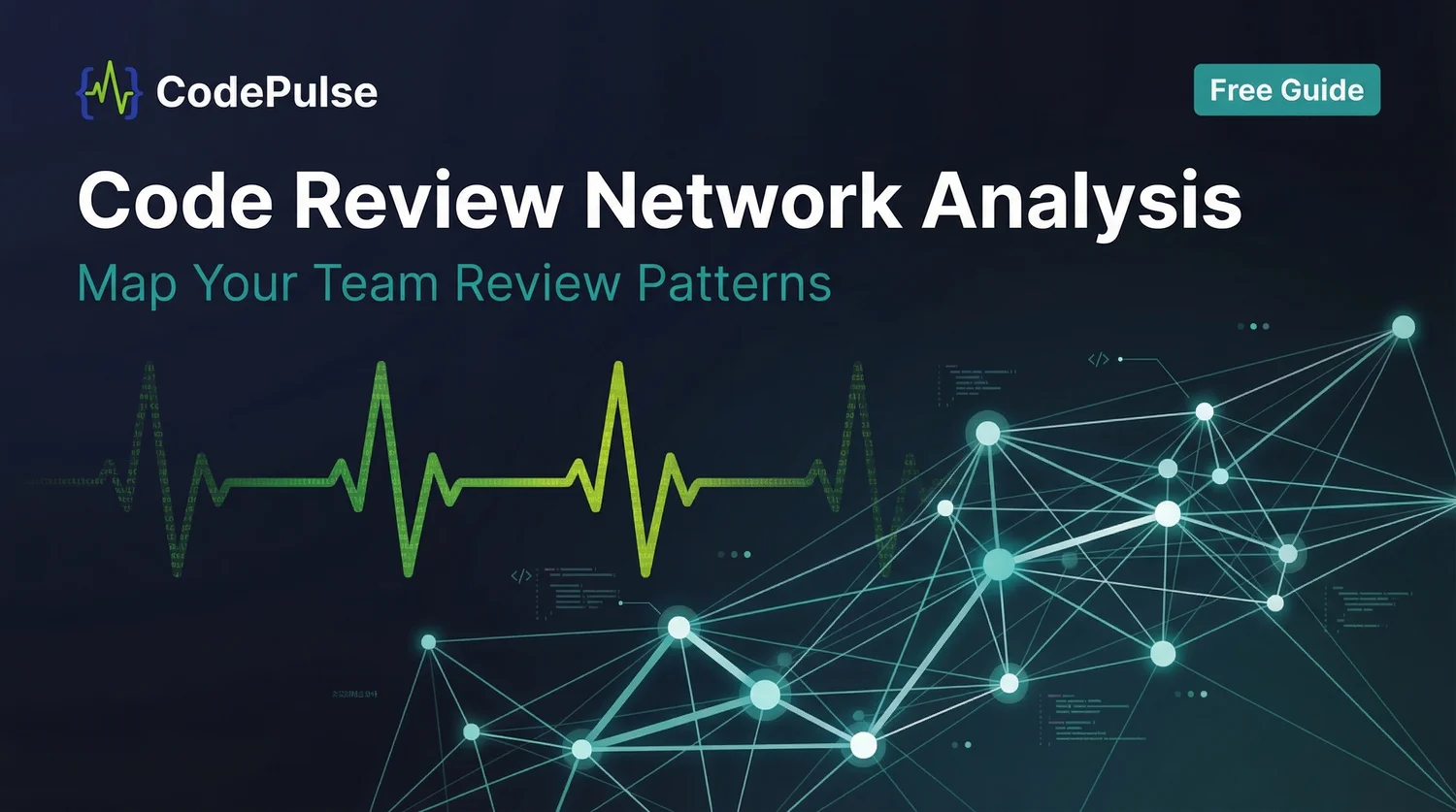
What Does a Code Review Network Visualization Show?
The review network takes your raw GitHub review data and renders it as nodes (developers) and edges (review relationships). Each edge is directed, from reviewer to author, and weighted by review count. The result is a map of how knowledge and feedback actually flow through your organization.
Each element in the graph encodes something specific:
| Element | What It Represents | What to Look For |
|---|---|---|
| Node size | Total review activity (given + received) | One outsized node = overloaded reviewer |
| Edge thickness | Review frequency between a pair | Thick edges = strong dependency or mentoring relationship |
| Edge direction | Who reviews whom | One-way edges = potential gatekeeping or rigid hierarchy |
| Clusters | Natural team groupings | Disconnected clusters = knowledge silos |
| Isolated nodes | Developers with no review edges | Self-merging or not participating in reviews |
Visualization adds context that flat metrics lack. A review count of 45 tells you nothing about whether those 45 reviews were spread across 12 different authors (healthy) or concentrated on 3 authors who happen to sit nearby (silo). The graph reveals the structure that numbers alone cannot.
"Review metrics tell you what happened. Review networks tell you why it keeps happening."
According to research published in the Journal of Systems and Software, graph-based visualization of code review data helps developers understand review change-sets better than traditional diff-based views. The logic extends to team-level analysis: seeing the shape of your review relationships reveals problems that spreadsheets and dashboards obscure.
📊 CodePulse Review Performance Visualization
Navigate to Review Network to see your team's interactive review performance dashboard:
- The network visualization renders nodes (developers) and edges (review relationships) with weighted connections
- Top Reviewers section highlights your highest-volume reviewers with medal rankings
- Review Relationships table lists every reviewer-author pair sorted by review count
- Filter by time period, repository, minimum review count, and exclude bots
- Export the raw data as CSV for deeper analysis in spreadsheets or BI tools
- Pair with Review Insights for sentiment analysis, review quality scoring, and rubber-stamp detection
How Do You Identify Unhealthy Review Patterns?
Reading a review network is like reading an X-ray. The symptoms - slow cycle times, rubber-stamped PRs, knowledge gaps after someone leaves - all have structural causes visible in the graph if you know what to look for. Pair the network view with CodePulse's Review Insights page for sentiment analysis and review quality scoring alongside the structural picture.
The three most common failure modes are:
1. The Single Point of Failure
One developer handles a disproportionate share of reviews. In graph terms, one node has high in-degree (many edges pointing toward it) while most other nodes have low in-degree. According to ShiftMag's analysis of code review problems, when the same few people handle all reviews, work piles up and creates a lasting bottleneck. The top 25% of engineering organizations get PRs reviewed in under 4 hours; the industry median is about one day; and the bottom 25% take over a day and a half.
2. The Echo Chamber
Two developers only review each other, forming a tight pair disconnected from the rest of the team. In graph terms, two nodes have thick bidirectional edges between them and almost no edges to other nodes. This pair might feel productive, but they are building a shared blind spot. Bugs they both miss will make it to production.
3. The Ghost Reviewer
A developer appears in the graph but only has one thin edge. They technically participate in reviews but contribute so little that removing them would not change the graph. This is often a senior engineer who rubber-stamps PRs with a "LGTM" and no comments. DZone's Code Review Patterns reference card categorizes rubber-stamping as one of the most damaging review anti-patterns, alongside knowledge silos and heroing.
"A team with 100% review coverage but one person doing 60% of the reviews is not a well-reviewed codebase. It is a codebase with a single point of failure that happens to leave comments."
What Are the Five Review Network Archetypes?
After studying review network visualizations across teams of different sizes and structures, five distinct patterns emerge repeatedly. Identifying which archetype your team's graph matches is the first step toward fixing structural problems. If you're new to CodePulse and setting up this analysis for the first time, our CodePulse onboarding guide walks through the first 30 minutes, including where the review network lives.

Archetype 1: Healthy Mesh
Every team member reviews and gets reviewed by multiple others. Edges are roughly even in weight. No single node dominates. This is the target state for teams of 4-10 engineers. It distributes knowledge, balances workload, and ensures no single departure breaks the review process.
Archetype 2: Hub-and-Spoke
One or two developers sit at the center with thick edges to every other node. The spoke nodes have thin or no edges between themselves. This is the most common anti-pattern. It feels natural because it often forms around the team lead or most experienced engineer, but it creates a fragile bottleneck. If that central node goes on vacation or leaves, review throughput drops to near zero. See our review load balancing guide for specific strategies to redistribute this pattern.
Archetype 3: Siloed Clusters
The graph splits into two or more tightly connected subgroups with few or no edges between them. Each cluster reviews only within itself. This maps directly to knowledge silos: if the payments team only reviews payments code and the platform team only reviews platform code, neither team understands the boundaries where their code meets.
Archetype 4: One-Way Chain
Reviews flow in one direction only: senior to junior, or from a single reviewer to everyone else without reciprocation. In graph terms, edges are highly directed with minimal reciprocity. This pattern can indicate healthy mentoring (intentional) or gatekeeping (accidental). The difference is whether juniors eventually start reviewing seniors. If the chain persists unchanged over 3 or more months, it has become a rigid hierarchy rather than a mentoring phase.
Archetype 5: Isolated Nodes
Multiple team members appear in the graph with zero or near-zero edges. They merge code without reviews or are excluded from reviewing others. This is the most dangerous pattern because it means code ships to production without peer review. A study of GitHub repository contribution patterns found that about 65% of popular repositories had a truck factor of two or fewer, meaning loss of just two contributors would critically impact the project. Isolated nodes make this problem worse because their code is not reviewed by anyone else.
🔥 Our Take
Your "fastest" reviewer is probably your biggest bottleneck. When one person does 3x the reviews of anyone else, they are not a hero - they are a single point of failure and a burnout risk. Distribute the load.
Review overload is invisible work. It does not show up in commit stats, so it is easy to miss until someone quits. The review network graph is the only way to see this structural problem before it costs you your most experienced engineer. If your network has a hub-and-spoke shape, your first priority is breaking that pattern, not celebrating the hub.
How Do You Fix a Hub-and-Spoke Bottleneck?
Hub-and-spoke is the most common anti-pattern because it forms naturally. The team lead or senior engineer starts reviewing everything because they know the codebase best. New team members default to requesting reviews from the same person because their first PR got reviewed by that person. Within weeks, one developer handles 40-60% of all reviews.
You need deliberate structural changes to break this pattern:
Step 1: Make the pattern visible with your review dashboard
Show the team the review network visualization. Most people have no idea how concentrated their review patterns are. Visibility alone changes behavior. When a senior engineer sees in the graph that they handled 55% of reviews last month, they will naturally start redirecting requests.
Step 2: Implement round-robin assignment
GitHub's CODEOWNERS and review assignment features support automatic round-robin distribution. Configure your CODEOWNERS file to assign from a group rather than an individual:
# Instead of this (creates hub-and-spoke):
*.py @senior-engineer

# Do this (distributes reviews):
*.py @backend-team

# GitHub will round-robin assign from the team
# Enable "load balancing" in team review settings
Step 3: Set review load targets
Define a target ratio: no individual should handle more than 25% of reviews on a team of 4 or more. For a team of 8, that means no one does more than 12.5% of total reviews. Track this monthly using the review network data.
Step 4: Pair junior reviewers with senior ones
Instead of having the senior engineer review alone, assign two reviewers: one senior and one junior. The junior reviewer learns the codebase and review standards. Over 4-8 weeks, the junior can take over as primary reviewer for familiar areas. Our guide on optimal reviewer count explains why two reviewers hits the sweet spot for catching issues without creating overhead.
Review Load Distribution Targets
---------------------------------
Team of 4:  Max 30% per person  (target: ~25%)
Team of 6:  Max 22% per person  (target: ~17%)
Team of 8:  Max 18% per person  (target: ~12.5%)
Team of 12: Max 14% per person  (target: ~8%)

Formula: Target = 100% / team_size
Red flag:  Anyone exceeding 2x the target
"The goal is not equal review counts. It is that no single person's absence breaks the review process for more than one day."
How Do You Detect Knowledge Silos Through Review Visualization?
Knowledge silos cost more than any other problem a review network visualization can surface. When teams only review within their own group, they build implicit walls around parts of the codebase. Those walls become visible the first time someone is out sick and nobody else can review a critical change in their area.
In the review network graph, silos show up as disconnected clusters or clusters with only one thin edge between them. Diagnosing and measuring the problem comes down to a few specific checks:
Measuring cluster isolation
Count the cross-cluster review edges. If two sub-teams of 5 engineers each have 20 internal review pairs but only 2 cross-team pairs, your cross-pollination rate is just 10%. Healthy teams maintain at least 20-30% cross-team review activity.
The bus factor test
For each area of your codebase, ask: "If two specific people left tomorrow, could anyone else review changes to this code?" If the answer is no, the review network has revealed a bus factor problem. A Hacker News discussion on bus factor visualization tools highlights that teams consistently underestimate how concentrated their knowledge is until they see it mapped visually.
Breaking silos with deliberate cross-team reviews
The fix is not to remove team-based review routing entirely, but to add a cross-team review rotation. Assign one PR per sprint for each engineer to review from a different team. This single change builds cross-team understanding incrementally without overwhelming anyone.
Track progress by monitoring the number of unique review pairs in your network over time. If a team of 8 has only 10 unique review pairs in month one, the target should be 16-20 pairs by month three. CodePulse's Review Network page shows this as the "Unique Review Pairs" metric, making it easy to track without manual counting.
How Should You Track Review Network Health Over Time?
A single snapshot of your review network tells you where you are. Tracking it over time tells you where you are heading. Review networks shift as teams grow, reorganize, and form new habits. A monthly cadence catches problems before they solidify.
The Review Network Health Matrix
We use a five-dimension framework to assess review network health. Each dimension maps to a specific structural property of the graph, scored as Healthy, Warning, or Critical.

Score your team across all five dimensions monthly. A team that is "Healthy" on Distribution but "Critical" on Connectivity still has a serious problem: reviews are evenly spread within silos but not across them. The matrix forces you to look at the full picture rather than optimizing a single dimension.
Using the framework in practice
Take a team of 8 engineers scoring themselves:
| Dimension | Current Score | Evidence | Action |
|---|---|---|---|
| Distribution | Warning | Top reviewer handles 35% of reviews | Enable round-robin assignment |
| Connectivity | Healthy | 68% of possible pairs have reviewed each other | Maintain current routing |
| Reciprocity | Healthy | 55% of review pairs are bidirectional | No immediate action needed |
| Breadth | Warning | 2 engineers have only 1 unique reviewer | Add second reviewer for those engineers |
| Participation | Healthy | All 8 engineers gave at least 3 reviews this month | Maintain expectations |
This team has a distribution problem (one overloaded reviewer) and a breadth problem (two engineers with only one reviewer each), but their overall connectivity, reciprocity, and participation are healthy. The fix is targeted: redistribute load from the top reviewer and add a second reviewer for the two under-covered engineers.
Monthly review network check-in template
Run this check on the first Monday of each month:
Monthly Review Network Check-in
================================
1. Pull 30-day review network from CodePulse (/review-network)
2. Score each dimension: Distribution, Connectivity,
   Reciprocity, Breadth, Participation
3. Compare to last month's scores
4. Identify: What changed? Why?
5. Pick ONE dimension to improve this month
6. Set a specific target (e.g., "Reduce top reviewer
   share from 35% to 25%")
7. Review progress at next month's check-in

Focus on one dimension per month.
Trying to fix everything at once changes nothing.
Review network health is a lagging indicator. Changes you make today (adjusting CODEOWNERS, rotating review assignments, onboarding a new reviewer) take 4-6 weeks to show up in the graph. Track trends, not individual data points.
How CodePulse review visualization compares to other platforms
Several engineering analytics platforms offer review-related dashboards, but they differ in what they actually visualize. LinearB provides review metrics like pickup time and review time within its developer pipeline view. Those numbers are useful for speed tracking, but LinearB does not render a network graph of reviewer-author relationships. You get individual reviewer stats, not the structural picture of who reviews whom and how load distributes across the team.
Swarmia takes a similar metrics-first approach, surfacing review turnaround times and working agreements around review SLAs. It helps teams set targets for how fast reviews should happen, but it does not visualize the collaboration network itself. You can see that reviews are slow, but not why - whether one person is overloaded, whether sub-teams are siloed, or whether certain engineers never get reviewed by anyone outside their immediate group.
CodePulse's Review Network page generates the actual relationship graph: nodes for developers, weighted edges for review frequency, filterable by time period and repository. Combined with the Review Insights page for sentiment and quality scoring, you get both the structural and qualitative view of your review process in one place. Speed metrics alone cannot reveal structural problems like overloaded reviewers or siloed teams.
"If you cannot draw your team's review network from memory, you do not know how your team actually collaborates. The graph is the truth. Everything else is assumption."
Frequently Asked Questions
Code review network analysis maps the reviewer-author relationships across your team as an interactive graph. Each developer is a node, each review relationship is an edge, and the thickness of the edge represents how often that pair reviews each other. This performance visualization reveals bottlenecks, knowledge silos, and collaboration imbalances that are invisible in raw review metrics or standard analytics dashboards.
See these insights for your team
CodePulse connects to your GitHub and shows you actionable engineering metrics in minutes. No complex setup required.
Free tier available. No credit card required.
See These Features in Action
Interactive graph of review relationships and workload distribution.
Detect bus-factor-1 code before it becomes an operational risk.
Related Guides
7 Code Review Rules That Actually Get PRs Approved Faster
Learn code review best practices backed by metrics. Covers reviewer guidelines, author guidelines, team practices, and how to measure review effectiveness.
Your Best Engineer Is About to Quit (Check Review Load)
Learn how to identify overloaded reviewers, distribute review work equitably, and maintain review quality without burning out your senior engineers.
3 GitHub Review Features That Cut Our Review Time in Half
Most teams underuse GitHub native review features. Learn CODEOWNERS, branch protection, and suggested changes to speed up reviews without new tools.
The Exact Number of Reviewers Per PR (Research Says 2, But...)
Research-backed guidance on how many reviewers you need per pull request, with strategies for matching review depth to risk level.