

See exactly where your delivery flow is waiting
Preview the phase-by-phase report for review pickup, active review, and merge time. Connect in about five minutes; the initial analysis runs after sync.
Read-only GitHub · Your code stays yours · Team-level by default · No credit card
A DevOps dashboard's entire job is to answer "how healthy is our delivery pipeline right now" without anyone having to open five different tools and mentally merge the results. Done well, it's the single screen a team glances at during a standup or an incident retro. Done badly, it's a wall of charts nobody trusts because half the numbers are computed inconsistently or nobody agreed what "healthy" means for this team specifically.
What is a DevOps dashboard?
A DevOps dashboard is a visual, at-a-glance view of software delivery pipeline health, most commonly built around the four DORA metrics - deployment frequency, lead time for changes, change failure rate, and mean time to recovery - plus supporting signals like build success rate and open incident count. Its purpose is to replace manually querying CI logs, deployment records, and incident trackers separately with a single, continuously updated view a team can check daily and leadership can check without translation.
The four DORA metrics became the near-universal starting point after Google's DevOps Research and Assessment team published years of research linking them to organizational performance, but a dashboard built on exactly those four and nothing else usually misses earlier warning signs - cycle time creeping up, review coverage dropping - that predict a deployment problem before it becomes a change-failure-rate statistic.
A dashboard that only shows what happened at deploy time is watching for smoke after the fire's already started upstream in code review.
What Should Actually Be on the Dashboard?
Start with the four DORA metrics, since they're the shared vocabulary most engineering leaders and researchers already use, then add the two signals that sit upstream of deployment and tend to predict trouble before DORA's own numbers move: cycle time (how long a change takes from first commit to merge) and review coverage (whether PRs are getting a real review or a rubber stamp before merging).
Build It Yourself, or Buy One?
A homegrown dashboard (Grafana or a custom internal tool fed by a script pulling GitHub, CI, and incident-tracker APIs) gives full control over exactly what's shown and how it's computed, but it's a real, ongoing engineering commitment - someone has to maintain the integrations every time a tool in your stack changes, and that maintenance tends to get deprioritized the moment the person who built it moves to other work. A bought platform trades some of that customization for a dashboard that works on day one and stays working without dedicated internal maintenance.
| Your situation | Recommendation |
|---|---|
| You already run Grafana/Datadog and have a platform team with spare capacity | Build it into your existing observability stack |
| Under ~50 engineers, no dedicated platform team | Buy - the maintenance cost of a custom pipeline rarely pencils out |
| You need it working this week, not this quarter | Buy - a GitHub-native tool can show real numbers within minutes |
* Our Take
Most failed DevOps dashboards fail on definitions, not data availability - "a deployment" and "an incident" mean something different to every team until someone writes the definition down.
Before wiring up any dashboard, agree in writing what counts as a deployment event, what starts and stops the mean-time-to-recovery clock, and what counts as a change failure. A dashboard built on inconsistent definitions produces a trend line nobody trusts, and a trend line nobody trusts gets ignored regardless of how good the tool is underneath it.
Where Does CodePulse Fit?
CodePulse computes the core DORA strip directly from GitHub data with no CI or incident-tracker integration required to get started, which covers the deployment frequency, lead time, and change failure rate legs of a typical DevOps dashboard. Mean time to recovery is approximated from deployment and revert patterns rather than a first-party incident-management integration, which is a real gap worth naming rather than glossing over if incident response time is your primary concern.
* How to See This in CodePulse
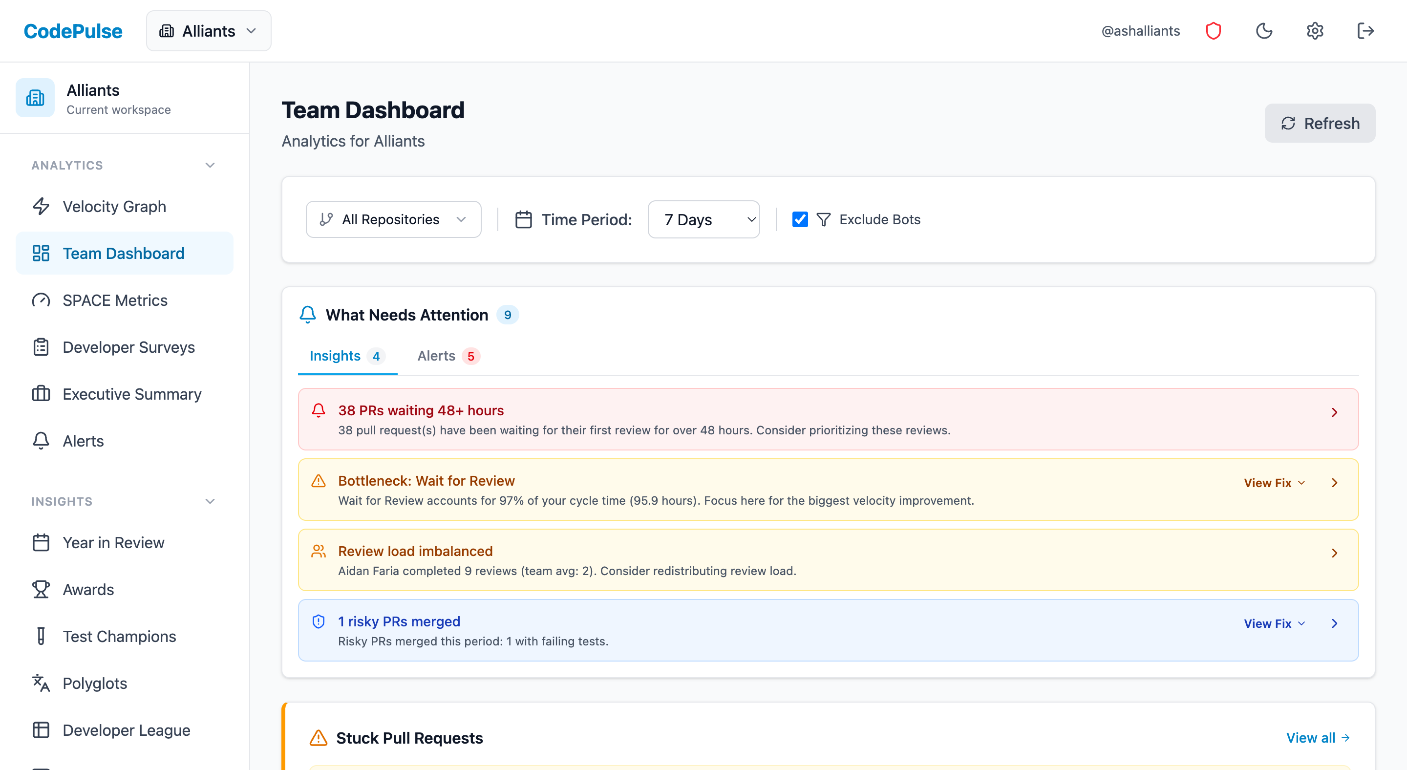
Navigate to Dashboard for the DORA strip plus the upstream signals that predict it:
- Deployment frequency, lead time for changes, and change failure rate computed from PR history
- Cycle time and review coverage as the earlier-pipeline signals that move before DORA metrics do
- Pair it with risky deployment detection to flag high-risk changes before they ship, not just after
A dashboard is only as trustworthy as the definitions underneath its charts - agree on those before you agree on which tool renders them.
For the DORA metrics in depth, see our DORA metrics guide or four keys implementation guide, and for the broader dashboard-building question, our engineering metrics dashboard guide.
If you want to see your own DORA strip built automatically from GitHub data, start a free CodePulse trial. There's nothing to configure before you see real numbers.
Frequently Asked Questions
A DevOps dashboard is a visual summary of delivery pipeline health, typically combining the four DORA metrics - deployment frequency, lead time for changes, change failure rate, and mean time to recovery - alongside supporting signals like build success rate, cycle time, and open incident count. Its purpose is to make delivery performance visible at a glance, rather than requiring someone to query CI logs, deployment records, and incident trackers separately every time leadership asks how things are going.
Find out which phase is holding your delivery up
CodePulse splits your cycle time into coding, waiting for review, active review, and merge, so you fix the queue that is actually costing you days. Read-only GitHub, no credit card.
Read-only GitHub · Your code stays yours · Team-level by default · No credit card
See These Features in Action
Explore all featuresRelated Guides
DORA Metrics Explained: The 4 Keys Without the Hype
A complete breakdown of the four DORA metrics - deployment frequency, lead time, change failure rate, and MTTR - with honest benchmarks and gaming traps to avoid.
No CI/CD Access? Here's How Google Measures DORA Anyway
Measure DORA Four Keys (deployment frequency, lead time, change failure rate, time to restore) using only GitHub data - no CI/CD integration required.
Engineering Metrics Dashboard: The 7 Metrics You Need
Skip vanity metrics. Here are the 7 engineering metrics VPs actually need to track team performance, delivery, and quality.
The DORA Metric Everyone Ignores (Until Production Breaks)
Learn how to measure Change Failure Rate and Mean Time to Restore using GitHub data, even without full incident tracking integration.
The PR Pattern That Predicts 73% of Your Incidents
Learn how to identify high-risk pull requests before they cause production incidents.