
See these metrics for your own team
CodePulse turns your GitHub history into engineering insights in about 5 minutes. Free to start, no credit card.
Get started freeAs a VP or Director of Engineering, you're constantly asked to demonstrate the value your team delivers. Yet most engineering leaders rely on gut feelings or anecdotal evidence when reporting to executives. An effective engineering metrics dashboard changes that - providing data-driven visibility into team performance, delivery velocity, and code quality.
What should an engineering metrics dashboard include?
An engineering metrics dashboard should include 7 core metrics: cycle time, deployment frequency, change failure rate, review coverage, team velocity trend, investment allocation, and bottleneck indicators. Avoid individual developer rankings. Focus on team-level patterns that drive delivery improvements.
This guide walks you through building a metrics dashboard that executives actually find useful, covering which metrics to track, how to present them, and common pitfalls to avoid.
Think of this as your software metrics and software engineering metrics playbook: a focused view of delivery, quality, and team health that leadership can act on. New to metrics? Start with our beginner's guide to software metrics first.
Why Engineering Metrics Matter for Leadership
Engineering organizations often operate as a black box to the rest of the business. Product managers see features ship (or not ship), finance sees costs, and executives see headcount - but nobody can see how the engineering machine actually works.
This visibility gap creates real problems:
- Difficulty justifying headcount: Without metrics, you can't demonstrate that adding engineers actually improves output
- Reactive problem-solving: Issues only surface when they become visible blockers, not when they're developing
- Misaligned expectations: Executives may have unrealistic views of engineering capacity and velocity
- Trust erosion: When engineering is a black box, stakeholders default to skepticism
A well-designed metrics dashboard addresses all of these by providing objective, consistent visibility into engineering operations.
🔥 Our Take
DORA metrics were designed for research, not management.
The DORA research identifies what elite teams do, not how they got there. Using DORA metrics as KPIs misses the point. They're signals, not goals. If your team is optimizing for "elite" status rather than shipping better software, you've already lost. Goodhart's Law applies - when a measure becomes a target, it ceases to be a good measure.
"The best metrics dashboard is the one that changes behavior. If nobody acts on the data, it's expensive wallpaper."
Essential Metrics for Your Dashboard
Not all metrics are created equal. The best engineering dashboards focus on a small set of meaningful indicators rather than drowning executives in data. We cover the full picture below; if you only have time for the headline view, the 7 KPIs that separate strong VPs from struggling ones is the shortest list you should ever build a dashboard around.
Velocity Metrics
PR Cycle Time measures the elapsed time from when a pull request is opened to when it's merged. This is your single most important velocity metric because it directly correlates with how quickly your team can ship changes.
- What "good" looks like: Elite teams maintain cycle times under 24 hours. Most healthy teams aim for 1-3 days.
- Why it matters: Long cycle times indicate bottlenecks in your process - usually in code review or waiting for CI.
Deployment Frequency tracks how often you ship code to production. This is one of the four DORA metrics and directly measures your team's ability to deliver value.
- What "good" looks like: Elite performers deploy multiple times per day. High performers deploy between once per day and once per week.
- Why it matters: Higher deployment frequency typically correlates with smaller, safer changes and faster feedback loops.
PRs Merged provides a simple count of completed work units. While not a perfect productivity measure (PR sizes vary), it's useful for spotting trends.
Quality Metrics
Review Coverage measures what percentage of code changes receive peer review before merging. This is a leading indicator of code quality.
- What "good" looks like: Most teams aim for 100% review coverage on production code.
- Why it matters: Code that bypasses review is significantly more likely to introduce bugs.
Average PR Size tracks how large code changes typically are. Smaller PRs are easier to review, less likely to contain bugs, and faster to merge.
- What "good" looks like: PRs under 400 lines of code get significantly better review effectiveness.
- Why it matters: Large PRs often indicate poor work decomposition or batching behavior.
Team Health Metrics
Reviewer Load Distribution shows whether code review responsibility is spread evenly or concentrated among a few individuals.
- What "good" looks like: Review load should be distributed across the team, with no single person handling more than 20% of reviews.
- Why it matters: Concentrated review loads create bottlenecks and burn out your senior engineers.
Time to First Review measures how long PRs wait before receiving their first reviewer comment. This is often the largest component of cycle time.
Building Your Metrics Dashboard
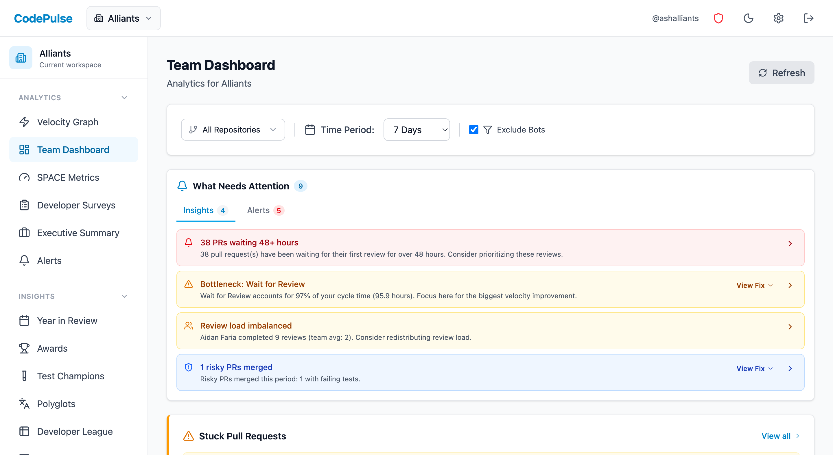
The most effective executive dashboards follow a hierarchical structure: high-level summary at the top, with the ability to drill down into specifics.
Executive Summary View
Your top-level dashboard should answer three questions at a glance:
- Are we shipping? (Deployment frequency, PRs merged)
- Are we shipping fast enough? (Cycle time, time trends)
- Are we shipping quality? (Review coverage, change failure rate)
Present these as simple, color-coded scorecards with trend arrows showing week-over-week or month-over-month changes. Executives don't need to see raw numbers - they need to quickly understand "good," "concerning," or "needs attention."
ENGINEERING HEALTH SUMMARY
Week of Jan 15Team-Level Breakdowns
Below the executive summary, provide the ability to drill into team-level metrics. This helps identify which teams are thriving and which may need support.
Key comparisons to enable:
- Team velocity over time (is the team improving?)
- Team-to-team comparisons (with appropriate context about team size and scope)
- Repository-level metrics (which codebases are healthy vs struggling?)
Trend Analysis
Static metrics are less valuable than trends. Always show metrics over time to answer "are we getting better or worse?"
Include:
- 30-day rolling averages (smooths out weekly noise)
- Week-over-week comparisons
- Month-over-month comparisons
- Annotations for significant events (major releases, reorgs, holidays)
Reporting to CTOs and Boards
The metrics you track internally may differ from what you present to executives. Here's how to translate engineering metrics into business language.
Frame Metrics in Business Terms
Instead of "PR cycle time decreased 40%," say:
"We've reduced time-to-market for features by 40%, meaning customer-requested changes now ship in days instead of weeks."
Instead of "Deployment frequency increased to 15/week," say:
"We've moved from monthly releases to continuous delivery, allowing us to respond to customer feedback within the same week."
Connect Metrics to Business Outcomes
Executives care about:
- Revenue impact: "Faster feature delivery lets us respond to competitive threats more quickly"
- Cost efficiency: "Improved automation has reduced our incident response costs by X%"
- Risk reduction: "Smaller, more frequent deployments have reduced our change failure rate"
- Team efficiency: "We're shipping more with the same team size, improving our output-per-engineer"
Benchmarking
Provide context by comparing your metrics to industry benchmarks. The DORA research provides well-established benchmarks for deployment frequency, lead time, change failure rate, and mean time to recovery.
"Our deployment frequency puts us in the 'High Performer' category according to industry research" is more meaningful than "We deployed 47 times last month."
Common Pitfalls to Avoid
1. Measuring Individual Performance
Using metrics to evaluate individual developers is tempting but counterproductive. It leads to gaming, erodes trust, and incentivizes the wrong behaviors (like splitting work into many small PRs just to inflate numbers).
Instead: Focus metrics at the team and organization level. Use individual data only for mentoring conversations, never for performance reviews.
2. Vanity Metrics
Lines of code, commit counts, and similar activity metrics are easy to measure but tell you nothing about actual value delivery.
Instead: Focus on outcome metrics (features shipped, cycle time) rather than activity metrics (commits made, lines written).
3. Ignoring Context
Metrics without context are dangerous. A spike in cycle time might indicate a problem - or it might indicate a major refactoring effort that's actually healthy.
Instead: Always provide context alongside metrics. Enable annotations for significant events. Compare like periods (not holiday weeks to regular weeks).
4. Too Many Metrics
Dashboard overload is real. Executives don't need 50 metrics - they need 5-7 that actually matter.
Instead: Ruthlessly prioritize. Start with DORA metrics plus one or two team health indicators. Add more only if there's clear demand.
Getting Started
Building an effective metrics dashboard doesn't require a massive investment:
- Start with what you have: GitHub provides basic metrics. Use these as your baseline before investing in specialized tools.
- Identify your biggest pain point: Is it cycle time? Review bottlenecks? Quality issues? Start by measuring that.
- Establish a baseline: You can't improve what you haven't measured. Spend 2-4 weeks collecting data before setting targets.
- Set realistic targets: Aim for incremental improvements. A 20% cycle time reduction is achievable; an 80% reduction probably isn't.
- Review regularly: Schedule weekly metric reviews with your team leads. Make metrics a normal part of your operating rhythm. For a structured approach, see our Weekly Engineering Status Report Template.
The goal isn't perfect metrics - it's better visibility. Even rough data is better than no data when you're trying to improve your engineering organization's performance.
Metrics Dashboard Checklist
Before Launch
- Defined 5-7 core metrics (no more!)
- Established baselines for each metric
- Created team-level vs individual-level views
- Set up trend visualization (WoW, MoM)
- Documented metric definitions clearly
Rollout
- Communicated purpose to engineering team
- Shared dashboard access with developers
- Explained what metrics WILL and WON'T be used for
- Identified 1-2 improvement targets
Ongoing
- Weekly review rhythm established
- Action items tracked from metric reviews
- Quarterly benchmark comparison
- Feedback loop from teams on metric utility
"A dashboard nobody looks at is worse than no dashboard - it consumed resources and delivered nothing."
For related guidance, see:
- Board-Ready Engineering Metrics - translate metrics for executive audiences
- Engineering Metrics Trust Guide - build trust while implementing measurement
- DORA Metrics Guide - the industry-standard framework for delivery metrics
Frequently Asked Questions
CodePulse for GitHub-native teams under 200 engineers. Jellyfish for enterprise orgs. LinearB for teams wanting CI/CD integration. Grafana for teams building custom dashboards.
See these insights for your team
CodePulse connects to your GitHub and shows you actionable engineering metrics in minutes. No complex setup required.
Free tier available. No credit card required.
See These Features in Action
Board-ready engineering performance in a single page.
Track all four DORA metrics and benchmark against industry standards.
Related Guides
DORA Metrics Explained: The 4 Keys Without the Hype
A complete breakdown of the four DORA metrics - deployment frequency, lead time, change failure rate, and MTTR - with honest benchmarks and gaming traps to avoid.
We Cut PR Cycle Time by 47%. Here's the Exact Playbook
A practical playbook for engineering managers to identify bottlenecks, improve review processes, and ship code faster - without sacrificing review quality.
The Complete Guide to Engineering Metrics in 2026
Engineering metrics are everywhere, but most teams measure the wrong things. This guide covers what to measure, what to ignore, and how to build a metrics program that drives decisions - not just reports.
The Status Report Template That Got Me Promoted
Stop writing status reports nobody reads. Here is a template for weekly engineering reports that executives actually find useful.
7 KPIs That Separate Great VPs From Struggling Ones
The essential metrics for VPs of Engineering, Directors, and CTOs. Covers executive dashboards, DORA metrics, team health, and stakeholder communication.
How to Measure Engineering Productivity (Without Spying)
A practical guide to engineering productivity - what it really means, how to measure it without surveillance, and frameworks that work.
The A-F System That Fixed Our Broken Engineering Team
Build health scorecards that give executives and stakeholders instant visibility into engineering team performance.
New to Metrics? Start With These 5 (Skip the Rest)
New to software metrics? This beginner-friendly guide covers what to measure, what to avoid, and how to use data to improve your engineering team.